Skip navigation

Monthly Archives: October 2007

(ok so the punctuation series is really just a bunch of typographic symbols)

The pilcrow is a common typographic symbol used to denote paragraphs.

The pilcrow was used in the Middle Ages to mark a new train of thought, before the convention of physically discrete paragraphs was commonplace.

The Oxford English Dictionary suggests that the name originated as pylcraft, a corrupted form of “paragraph.”

Desktop publishign software uses the pilcrow is symbolize a carriage return, or hard return (as opposed to a soft return). In Adobe InDesign, a hard return seperates paragraphs and contains paragraph styles. a soft return is just a line break.

on a mac ¶ is Option+7.

Working in web design, I was introduced to the pixel font Unibody a few months ago as legal copy on a banner ad. My creative director recommended Underware’s Unibody 8.

Unibody 8 was designed to work with screen pixels to create a clear and readable small typeface on the screen. This font needs no anti-aliasing (blurring around the pixels to create a smooth look).

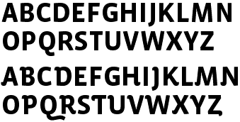
The Unibody family has 5 members. Roman, Italic, Bold, Black and Small Caps.

Unibody 8
serif: its 8 pt type, no.
usage: web design. good for use in photoshop and flash.
characteristics: 8 pt pixel font. Italics are all upright are similar to script.
cost: FREE

Underware explains the concept behind Unibody 8:
“As you probably know, the computer screen consists of very tiny squares called pixels. Quite often in a web design it is essential to choose a body text typeface which reveals this basic pixel construction. Adopting a strong ‘form-follows-function’ approach, screen type often focuses your eyes on the text without needing blurry anti-aliasing (computer generated curve-smoothening), which can be too heavy at a very small size like 8 pts.

For this reason we have developed Unibody 8-typeface, which is an optimized screen font family for Macromedia Flash MX and Adobe PhotoShop. It will remain aliased at size 8 pts, in other words it gives a crisp pixel image. We didn’t force the type to do anything other than what’s naturally possible with this basic 8 pixel grid. For example, the italic is upright (see sample below) to avoid broken diagonal stems. We also decided to give a width of two pixels for most of the letter spaces. Quite often this space is only one pixel, and that can force letters to melt into each other on poor monitors or at lower resolutions.”

Trajan’s Column is a Roman monument in Honor of Emperor Trajan and constructed by the architect Apollodorus of Damascus. The column is well known for its spiral bas relief depicting Trajan’s victory in the Dacian Wars. It is located just north of the Roman Forum in Rome, Italy.

The base of Trajans column featured Classic Roman Letterforms. it is believed that these letters were first painted on, then carved into the stone. This gave them a nice free formed feel and sharper serifs. The letters are called capitalis monumentalis or Roman square capitals.

Twombly designed Trajan in 1989 for Adobe as part of their Adobe originals collection.

Trajan
Serif: yes
lowercase?: since lowercase letters weren’t use in Ancient Rome, the LC letters are small caps.
Characteristics: all caps, sharp serifs, large swash on the Q.

Thanks Stacy for suggesting trajan

I was asked to work this weekend on an Intel campaign. First one in…

anyone know how to turn on the lights?

great Hellgate london video.

The exclamation point was Introduced in the 1400s as the “mark of admirition”.

The mark is based on the latin work “lo” which means joy. Before it was featured on the typewritter, ! was formed by typing a “.” followed by a backspace, then an apostrphe. it evolved into the perion and line we know and love today.

One of Zuzanas favorite typefaces is Bodoni. she was attracted to its clean lines and geometric shapes. However, she felt that Bodoni at a small size was tough to read.

Filosofia is Zuzanas interpretation of Bodoni’s work. She incorporated features such as a bulging round serif. She also reduced the stroke contrast in the regular weight (to combate the “dazzling” found in digital versions of Bodoni). The Filosofia grand family is more delicate and refined then the regulars.

Filosophia is Italian for Philosophy

Filosofia
Serif: flat and thin.
Use: regular for text and grand for headlines.
characteritics: personally I think that this is a very “soft” version of bodoni. it reads smoothly and cleanly.

This is a Brain Hemorrhage

This classic bar shot comes into its own at Halloween. It’s a glorious blend of grenadine, Peach Schnapps, and Bailey’s Irish Crème. If you make it right, the Bailey’s floats in a thick layer on top, with a curdling column descending through the Schnapps to the bloody grenadine below. It looks so cool, it’s almost a shame to drink it. Almost.

see the others

Giambattista Bondoni was a highly skilled Italian engraver, printer and typographer. His technical abilities helped him create the thin hairline serifs on the family of fonts named after him.

Bodoni studied the types of John Baskerville, He paid particular attention to the contrast of Baskervilles letters. Baskervilles type was said to make one blind because of its high contrast of letters, Bodoni is even higher in contrast. Bodoni was also inspired by the designs of Firmin Didot.

Bodoni
Serif: hairline serifs
classifications: Didone or modern
characteristics: High contrast between strokes, thin flat serifs, geometric.

Digital issues: Bodoni suffers from a form of digital degradation, called “dazzle”. the alternating thick and thin strokes are difficult for the screen to represent and inkjet printers to print cleanly. the thin strokes are to thin at the smaller point sizes. Also, digital type is based on one design, and mathematically scaled for different point sizes. Some designers found ways around dazzle with “optical scaling”.

Xavier Dupré began sketching Vista while on vacation in Sumatra. He noticed many of the hand made signs with interesting decorative letters, slab serifs and triangular serifs. His plan was to create a semi serif typeface based on this characteristics.

Dupré had difficulties early on and stopped the creation of this typeface. After 2 years he revisited his sketches and removed the Serifs, simplifing the entire face.

Dupré feels that Vista combines a humanist and blackletter typeface.

Vista Sans
Serif: sans
Usage: text and display.
Characteristics: Vista combines curves and sharp points nicely.
The a: “…In Vista, the “a” became the most characteristic letter. It’s the soul of Vista. The “a” has a special appeal to me; when I was a student, I learned to recognize and identify fonts by observing this character.

The “a” in Vista is inspired by blackletter. I wanted to incorporate the rhythm of blackletters; big contrast, emphasis on the vertical, graphic and strong looking. I combined this with humanist shapes to make a well-working text font. So the form and the rhythm of Vista are a blend of blackletter and humanist writing.” ~Dupré

note: there is also an alternate version of Vista.

Top: vista, bottom Vista Alternate.