Skip navigation

Category Archives: old style

Nicolas Jenson is said to have designed the first Roman typeface. Jenson learned the art of moveable type in the mid 1400s in italy, some believe he studied type with Gutenberg.

He type designs were based on the era’s Typographic principals. He later developed a greek typeface and a Black letter face.

Jenson started his own book trading companies. A 1482 advertisement about Jenson’s books said:

“do not hinder one’s eyes, but rather help them and do them good. Moreover, the characters are so intelligently and carefully elaborated that the letters are neither smaller, larger nor thicker than reason or pleasure demand.”

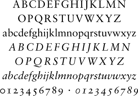
In 1966, Adobe released Abobe Jenson, a revival created by Robert Slimbach. The italics for Adobe Jenson are based on those by Ludovico Vicentino degli Arrighi, another italian type designer.

Adobe Jenson
Serif: Venetian oldstyle
usage: good for body copy
characteristics:low x-height, inconsistencies that help differentiate letters

Based on Garamonds self titles font, Sabon is a revival of of a revival (sabons other styles and weights were based on speciman sheets done by Konrad Berner.

Berner had married the widow of a fellow printer Jacques Sabon, the source of the face’s name. The italics are based on types designed by a friend of Garamond’s Robert Grandjon.

Sabon
serif: old style
usage: books copy, bibles (first used in one)
characteristics: elegant letter forms (sorry you need to just see it)

The French royalty used Garamond’s Roman letters for their printing which would influence the type created across Europe.

G’s letterforms convey a sense of fluidity and consistency.

His typeface designs are loosely based on the French royal librarians handwriting.

Garamond
serif: old style, venetian
characteristics: Some unique characteristics are the small bowl of the a and the small eye of the e. Long extenders and top serifs have a downward slope.

John Baskerville was an english printer in the 1700s. He worked with a punch cutter to create many of his designs.

Baskerville
Serif: Transitional
usage: books, body copy
characteristics: High contrast, shark serifs, verticle axis,

Being a perfectionist, Baskervilles typeface is so “perfect” in its contrasting strokes that it was said to make you go blind.

Based on the English typeface Caslon, Baskerville has been done revived many times over the years by Matthew Carter, František Štorm, Lars Bergquist and Zuzana Licko.

H&FJ have to be my favorite type foundry. overall their work is very readable yet still unique. They are a pair or Armchair Type Historians

Gotham
Serif:none
Usage: anything New York, anything cool
charcteristics: Geometric, open, many weights

A very interesting type design process. They planned to photograph every sign in Manhattan to use as a basis for their typeface.

[from typography.com] “Every designer has admired the no-nonsense lettering of the American vernacular, those letters of paint, plaster, neon, glass and steel that figure so prominently in the urban landscape.

Gotham is an adaptation of this vanishing style, which manages to feel strikingly new and comfortably familiar at the same time.”

Hoefler Text
Serif:yes
usage: anything and everything
characteristics: old style numberals, “classical book typography”

hoefler text was a 1991 experiment in Apple Advanced typography , giving it automatic ligatures and other complex typographic elements. includes a matching ornament font.